The Customer Fields feature in Booknetic allows administrators to create and customize dynamic customer information collection forms that appear in the customer profile. This feature enables businesses to gather additional customer data beyond standard fields, with full control over form elements, validation, visibility, and field conditions.
Accessing Customer Fields Configuration
Navigate to the Booknetic Admin Dashboard
From the left sidebar, click Customers Fields
The form builder interface will display
Form Builder Interface Architecture
The Customer Fields page consists of three main panels:
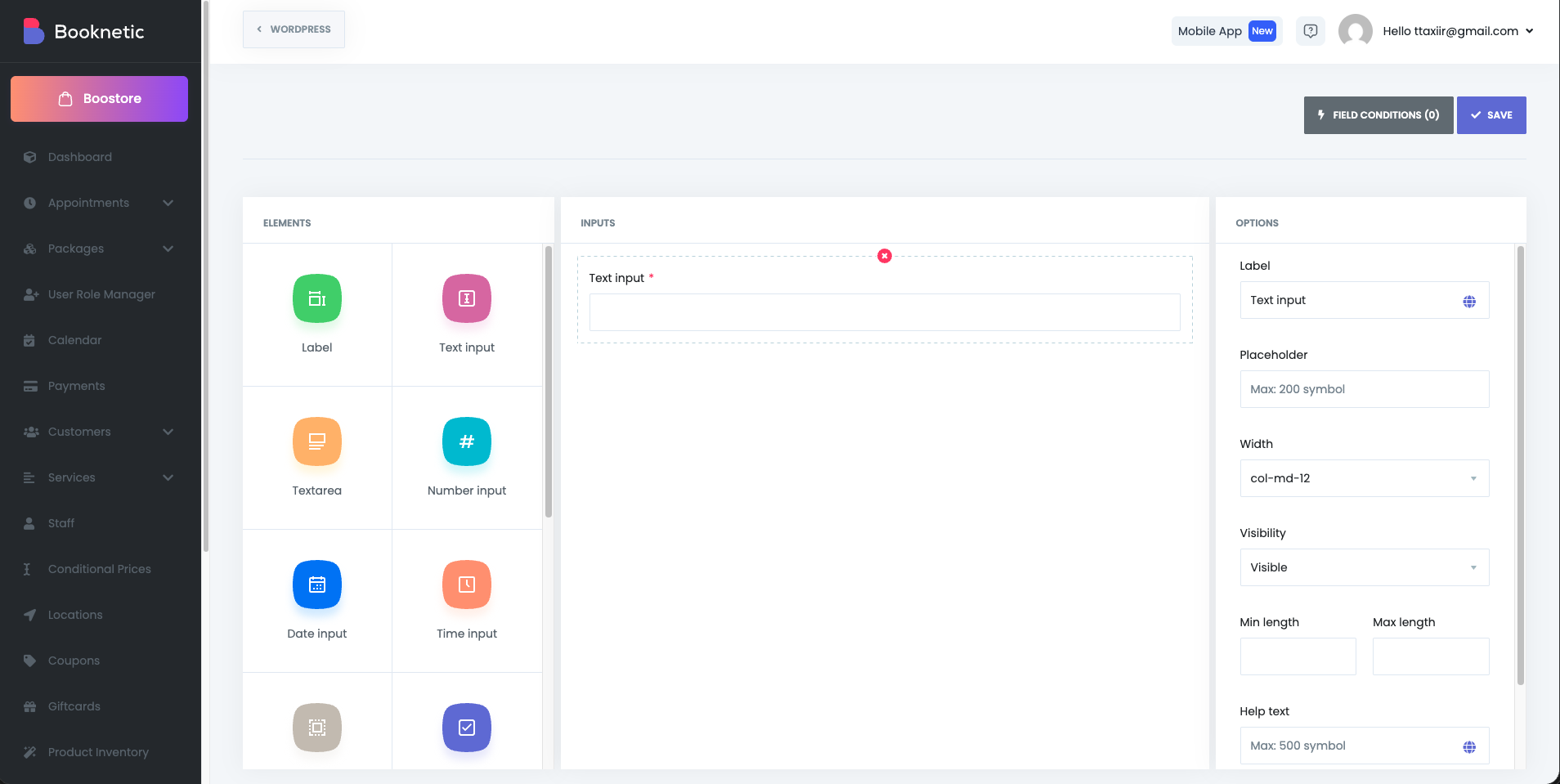
1. ELEMENTS Panel (Left Section)
Contains all available form field types that can be added to your customer form:
Label - Display static text or instructions
Text input - Single-line text entry
Textarea - Multi-line text entry
Number input - Numeric values only
Date input - Calendar-based date selection
Time input - Time selection field
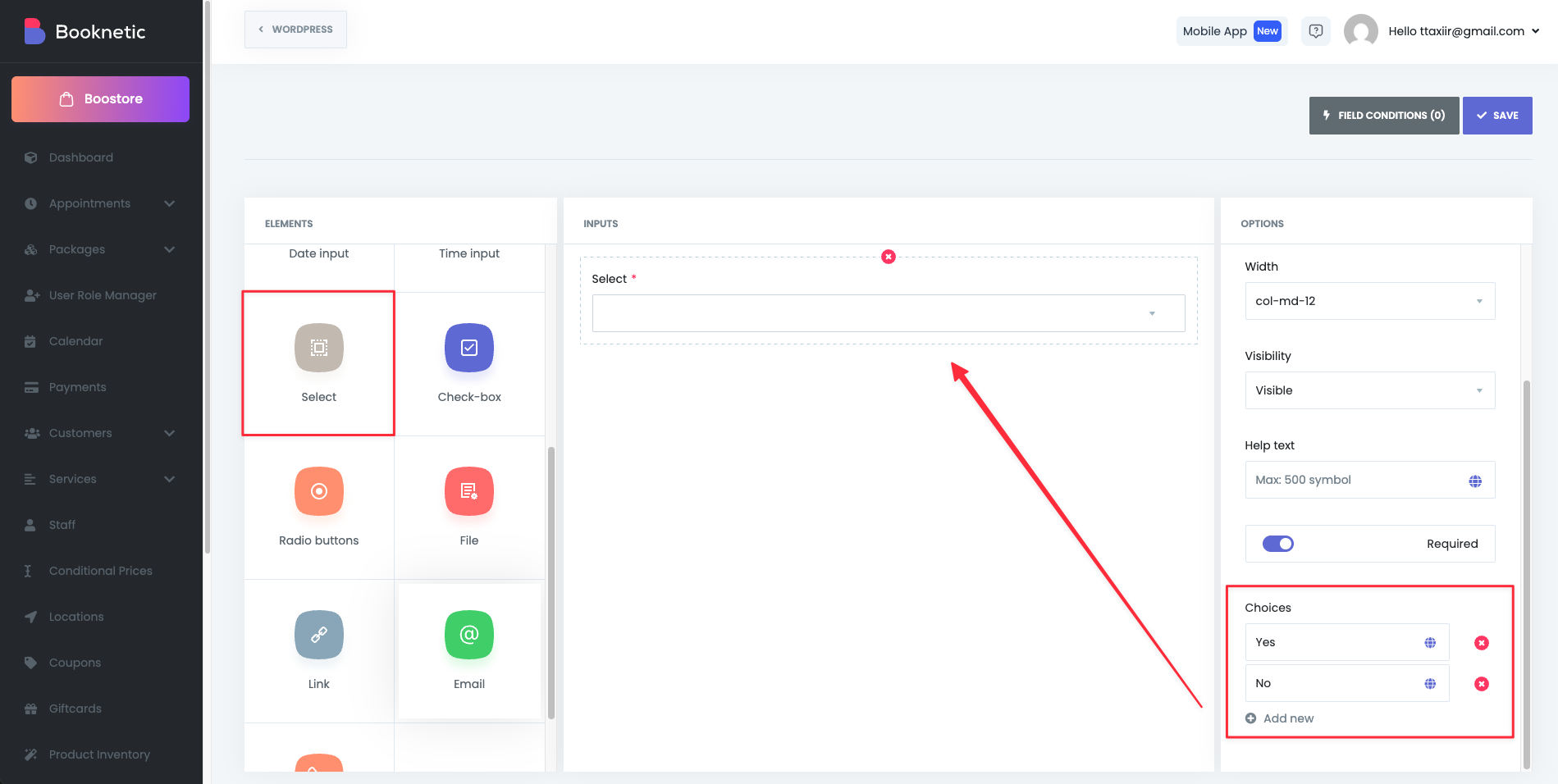
Select - Dropdown list (single selection)
Check-box - Boolean toggle option
Radio buttons - Multiple options with single selection
File - File upload capability
Link - URL/hyperlink input
Email - Email address with validation
Phone - Phone number input field
2. INPUTS Panel (Center Section)
The workspace where you build your form. Fields are added by dragging elements from the ELEMENTS panel into this area. Each field can be edited by clicking on it, which populates the OPTIONS panel.
3. OPTIONS Panel (Right Section)
Displays configuration settings for the currently selected field. Options vary by field type.
Field Configuration Options
Universal Configuration Options (All Field Types)
The following options are available for most field types:
Label
Field label that displays to customers in the booking form
Default values: "Number input", "Text input", "Select", etc.
This text appears above or next to the input field
Supports up to 200 characters
Placeholder
Hint text displayed inside empty input fields
Helps guide users on expected input format
Maximum 200 characters
Auto-populated with example text (e.g., "Max 200 symbol")
Optional field
Width
Controls the field's layout width on the form
Options (Bootstrap grid system):
Allows responsive field layout design
Enables placing multiple fields side-by-side
Visibility
Controls who can see and interact with the field
Options:
Visible (only admin panel) - Only visible to administrators in the backend
Visible - Visible to all customers in the booking form (default)
Hidden - Field is not displayed to anyone
Used for internal notes or backend-only fields
Can be combined with field conditions for dynamic visibility
Min length & Max length
Min length - Minimum number of characters required
Max length - Maximum number of characters allowed
Input type: Numeric spinbutton
Applies to text-based fields (Text input, Textarea, Number input)
Empty by default (no limits)
Validates data before form submission
Help text
Additional guidance or explanation displayed below the field
Maximum 500 characters
Appears in smaller/italicized text in the booking form
Useful for complex fields or providing examples
Optional field
Required
Toggle switch to mark field as mandatory
When enabled, customers must fill this field before submitting the form
Marked with a red asterisk (*) on the form
All required fields are indicated visually in the INPUTS panel
Field-Specific Configuration Options
Select/Dropdown Field (Additional Options)
Field Conditions (Rules) Feature
The Field Conditions feature allows you to create conditional logic for your customer fields. This enables dynamic form behavior where fields are shown, hidden, or have their values modified based on customer selections.
Accessing Field Conditions
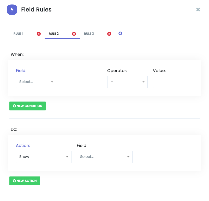
Click the "FIELD CONDITIONS (0)" button in the top-right toolbar
A "Field Rules" modal window opens
Rules display as numbered tabs (RULE 1, RULE 2, etc.)
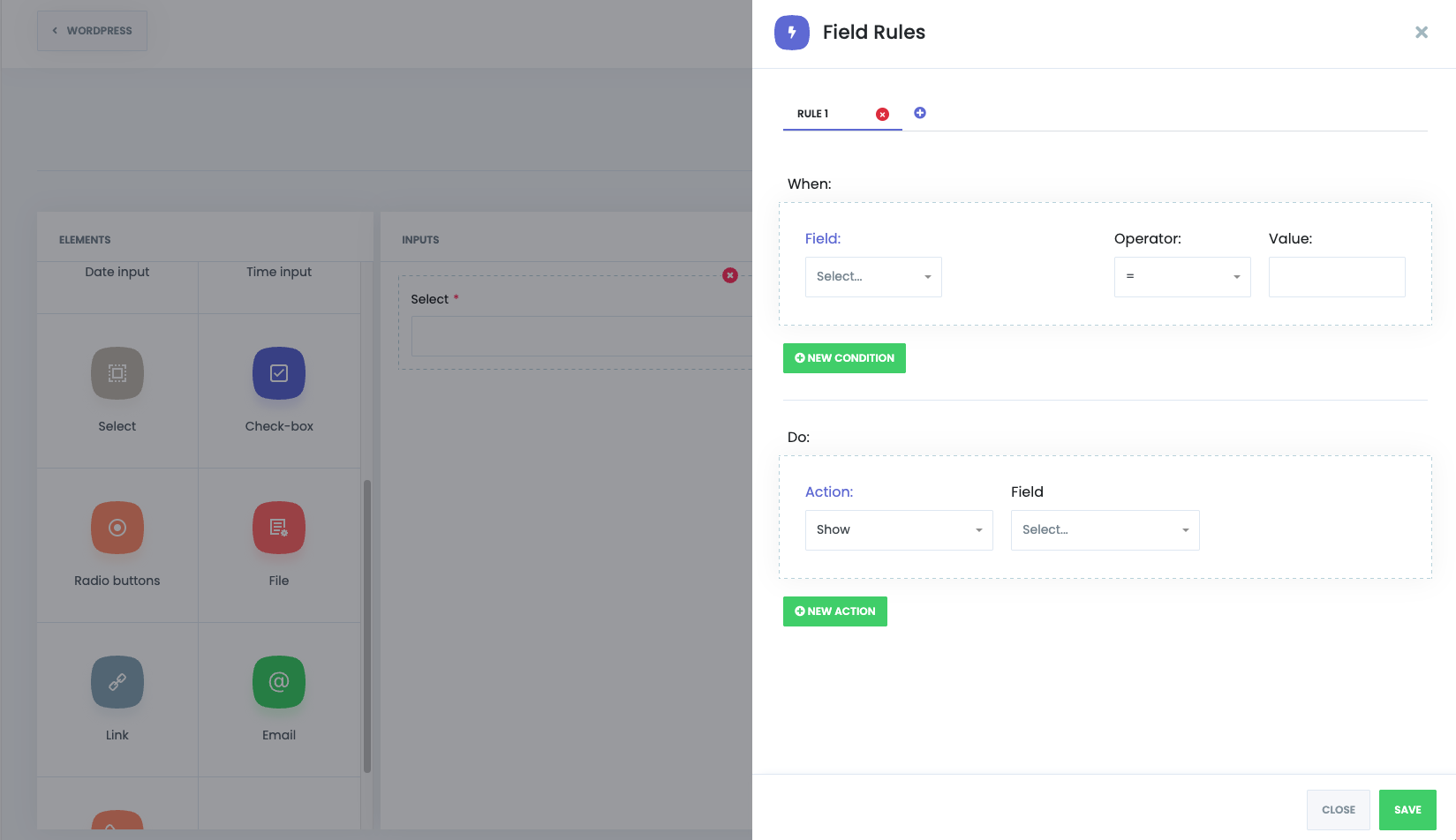
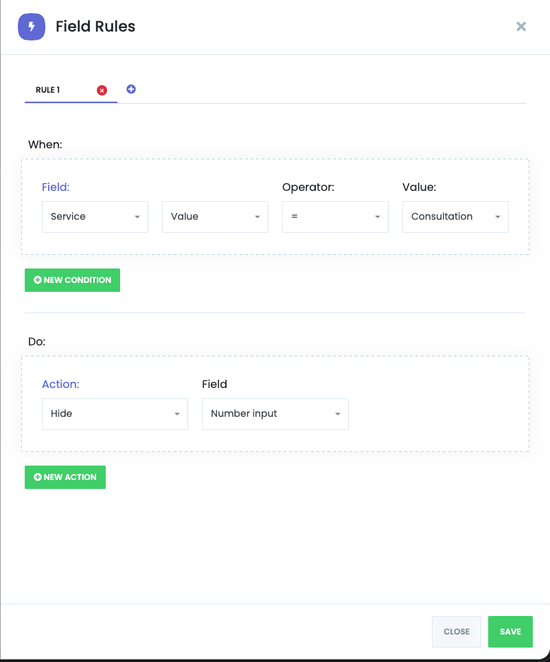
Rule Structure
Each rule follows an IF-THEN logic pattern with two sections:
"When:" Section (Conditions)
Defines the trigger condition(s) that must be met for the rule to activate.
Condition Components:
Field - The field to monitor for changes
Value Type - How to compare the field value
Value - Compare actual field values
Length - Compare text/field length
File size (kB) - Compare file upload size
Operator - The comparison operator to use
= (equals) - Exact match
!= (not equals) - Different from value
> (greater than) - Numerically greater
>= (greater than or equal) - Numerically greater or same
< (less than) - Numerically less
<= (less than or equal) - Numerically less or same
Value - The value to compare against
Multiple Conditions:
"Do:" Section (Actions)
Defines what happens when the condition(s) are met.
Action Components:
Multiple Actions:
Rule Management
Adding New Rules:
Click the duplicate icon (next to delete icon) to create a new rule based on current rule
Rules are numbered sequentially (RULE 1, RULE 2, etc.)
Deleting Rules:
Duplicating Rules:
Saving Field Rules
After configuring conditions and actions, click "SAVE" button in the modal
Rules are saved within the Field Conditions system
Click "CLOSE" to exit the Field Rules modal
Remember to click the main "SAVE" button in the top toolbar to save all form changes
Field Conditions Example Scenarios
Scenario 1: Show Additional Field Based on Service Selection
Condition: Service = "Haircut"
Action: Show "Hair Type" field
Result: Only when "Haircut" service is selected, the "Hair Type" field appears
Scenario 2: Hide Admin-Only Field from Customers
Condition: (Always true - no condition needed)
Action: Hide only for Customers on "Internal Notes" field
Result: Admin sees the field, customers don't
Scenario 3: Require Phone Field Based on Service
Condition: Service = "Remote Consultation"
Action: Set Required = true on "Phone Number" field
Result: Phone field becomes required only for remote consultation selections
Scenario 4: Disable Location Selection Based on Staff
Condition: Staff = "Remote Staff"
Action: Disable "Location" field
Result: Location field is grayed out and uneditable when remote staff is selected
Performance Tips
Use specific field conditions to reduce form clutter
Avoid excessive nested conditions that may confuse users
Test rules in the booking form to ensure proper behavior
Consider default field visibility and use conditions for exceptions
Document rule logic for future maintenance
Saving Configuration
Click the SAVE button (top-right, blue button) to persist all changes
Changes are applied to the booking form form immediately after saving
Unsaved changes are lost if page is refreshed