
It’s a common problem for business owners worldwide. They invest thousands of dollars to create a stylish and simple for the understanding website. They hire the best programmers, SEO specialists, and designers but the conversion is still disappointing. Of course, there can be a lot of reasons for this situation, including high prices, poor customer support, or a limited assortment of goods. However, there are also high chances that your call-to-action (CTA) button needs improvements.
Even despite the fact that business owners often do not take into account this tiny element of the website, a high-quality CTA button can increase your sales and earnings. Thus, consider these most costly CTA mistakes and learn to avoid them in your marketing messages.
What Are the Most Common CTA Mistakes?
Mastering the CTA is the most skill of a content writer, so don't be frusturated if you can't get it right the first time (or the second, third, fourth and the fifth). But, if you want to create a winning CTA, you should realize the most common mistakes that ruin the effectiveness of your message:
-
The button doesn’t grab the attention of clients
If your potential customer cannot find the CTA, it means that the client cannot buy your product. It’s important to make sure that potential clients will manage to find this button without problems. When a potential customer visits your website, he or she has to find the CTA button from the very beginning. Of course, this button should not be annoying but the client has to understand how to find it quickly. It’s a good idea to consider different colors of the button. Use colors that contrast yet complement the main color of your website.
Only if you manage to combine the colors to make your CTA button unique and eye-catching, can you expect an increase in your earnings.
You can also get the appointment booking plugin to customize your CTA. In this instance, you are not obliged to use a boring “book now” button. There is a possibility to change the text of CTA and make it unique and eye-catching. For example, it’s possible to use customized plugins to appoint meetings instead of ordinary buttons. These plugins make your CTA flexible because you can adjust the button according to your needs.
-
Users do not understand what the button says

Now, when users face the same CTAs over and over again, it might sound good to experiment with creative phrases. After all, the trait “Submit” button has proved to be less effective than buttons highlighting the gain for the user. The truth is, smart allusions and coined words may lead to confusion and lower conversion rates even more. If you have enough traffic to your website, it is recommended to run A-B tests to see if creative alternatives perform better than traditional incentives.
-
There is only one CTA button
Placing several booking forms and CTA buttons that invite users to perform one action is a good practice to follow. However, you should be cautious about including several different CTAs on one web page. On the one hand, you might want your product page or blog to serve diverse purposes so that, depending on the stage of the customer journey, a user may choose to convert to the one that fits him best. On the other hand, several CTAs may introduce some confusion and make you lose the attention of your client. To avoid this, consider placing secondary CTAs on success pages or in exit-intent pop-ups. More on that further.
-
Your CTA is not optimized for mobile

According to a recent study, the number of people who use mobile phones to visit websites or buy something online is more than 52 % of users. It’s quite obvious that the number of these people is going to increase in the near future. So, if you want to leverage digital marketing, you should be flexible and make your websites optimized for smartphones. Don’t forget to optimize the CTA button because it really matters.
-
Ask for one action at a time
You need to make the result of this button clicking quite obvious for customers. Still, even if you do, stick to one expected result on one page. It’s a common problem that some business owners add buttons that require very different actions from a client. For example, they ask users to download, try, and buy a product or service on one single page. This may create confusion and deter users from converting to any of the CTAs. If you use a free trial or a downloadable freebie as lead magnets, better use the “buy” button on the success page or in the follow-up emails to the user.
Concluding Ideas
The quality of your CTA button really matters. If you want to increase your conversion and sales, you should pay attention to the possible mistakes of your calls to action. Not to get into the trap of using illegible CTAs with poor copy, use booking plugins like Booknetic that offer creation of custom forms and customizable design. This will also let you test the effectiveness of appointment booking forms with different CTAs, as well as the relation between the conversion and the amount of information you request from a user. See how it works here.
Similar blog posts
See all blogs

Participate in Our Exclusive Beta Testing Program
Explore how our community members can now play an active role in shaping the future of appointment scheduling. Dive into the benefits of beta testing, see how your feedback drives meaningful changes, and learn how you can join this exclusive journey.
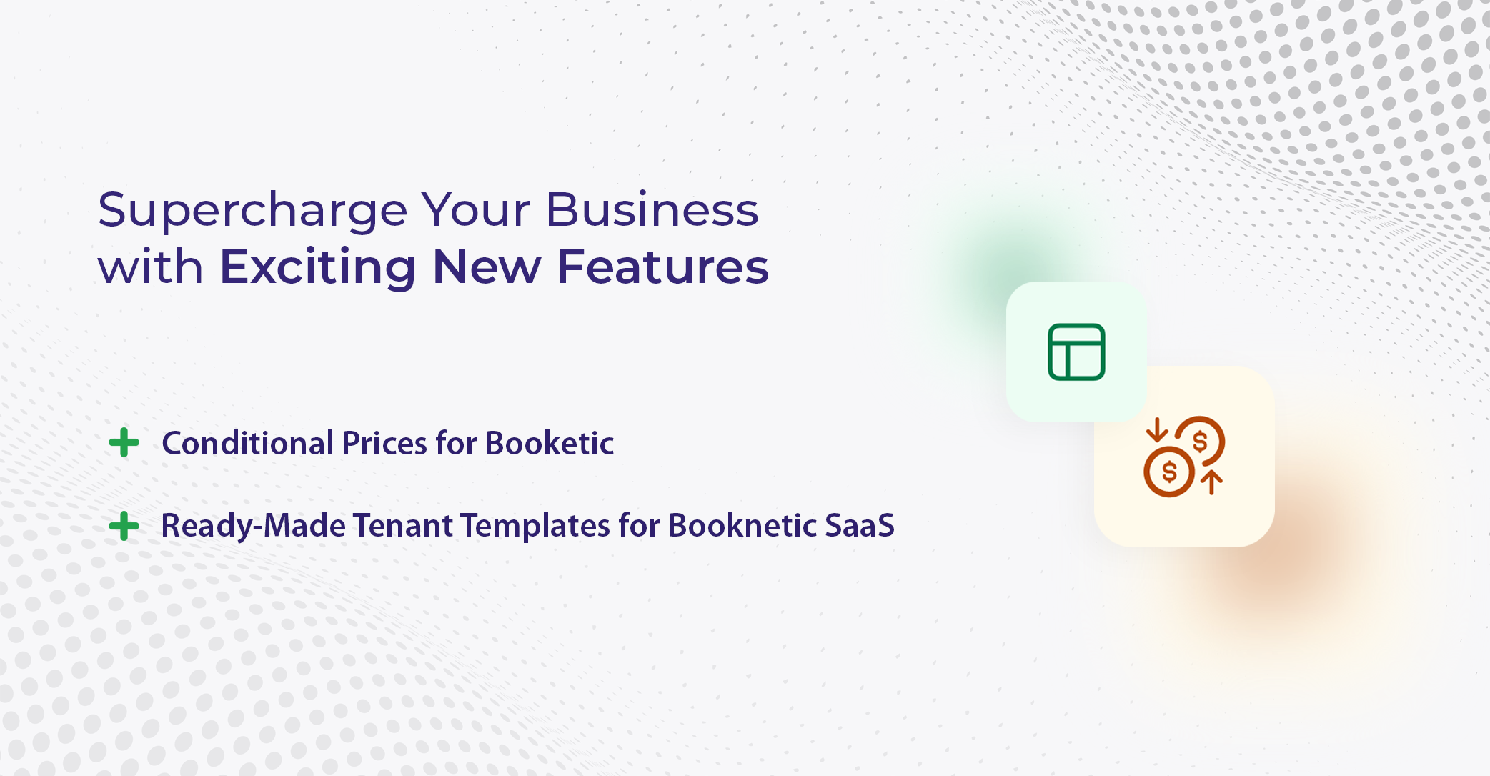
Supercharge Your Business with Exciting New Features
Discover the latest advancements in Booknetic with the introduction of Conditional Fields and Ready-Made Tenant Templates. Streamline your workflows, personalize customer interactions, and simplify setup processes with these powerful features.
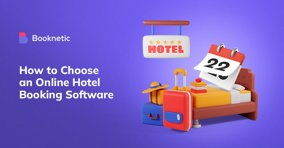
How to choose an online hotel booking software?
An online hotel booking software allows paying online, automates certain actions, etc. Learn how to find the right booking software from the article.
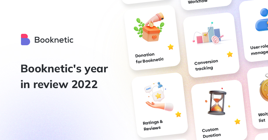
Booknetic's Year in Review 2022: Custom Duration, Conversion Tracking, and more!
2022 was a year with full of surprises. We’re recapping the biggest things that we made to WordPress appointment booking in 2022.
Sign up for our newsletter
Be the first to know about releases and industry news and insights.